careQ: Digital Waiting Room Queue
Patients at a primary care office aren't just waiting, they are stuck in this liminal space that breeds frustration. To fix that, we gave them back their time. I served as the design and project lead for careQ, a service that visualizes the doctor’s office queue in real-time.
Overview
By mapping the friction between patient anxiety and staff workflow interruptions, we identified that the waiting problem was actually an information architecture problem that led us to prioritize system transparency over spatial redesign. What began as a challenge to improve the physical comfort of a waiting room quickly shifted when our research revealed that no amount of amenities could solve for the anxiety of the unknown. We didn't just redesign a room; we redesigned the relationship between patients and their care providers.
Project Reframe
Duration: 8 weeks
Collaborators: Alice Qiu, Katres Brahmnhatt & Parker Gillis
Role: UX Design, Service Strategy, Project Management, Research
Tools: Figma, Miro, Canva
Audience
careQ was designed for two interconnected users: primary care patients and front desk receptionists. Patients were our primary focus, but it quickly became clear that their anxiety didn't stay in the waiting room. It directly disrupted staff workflow and even colored the care interaction before a doctor ever walked in. Solving for one without the other would have addressed the symptom, not the system.
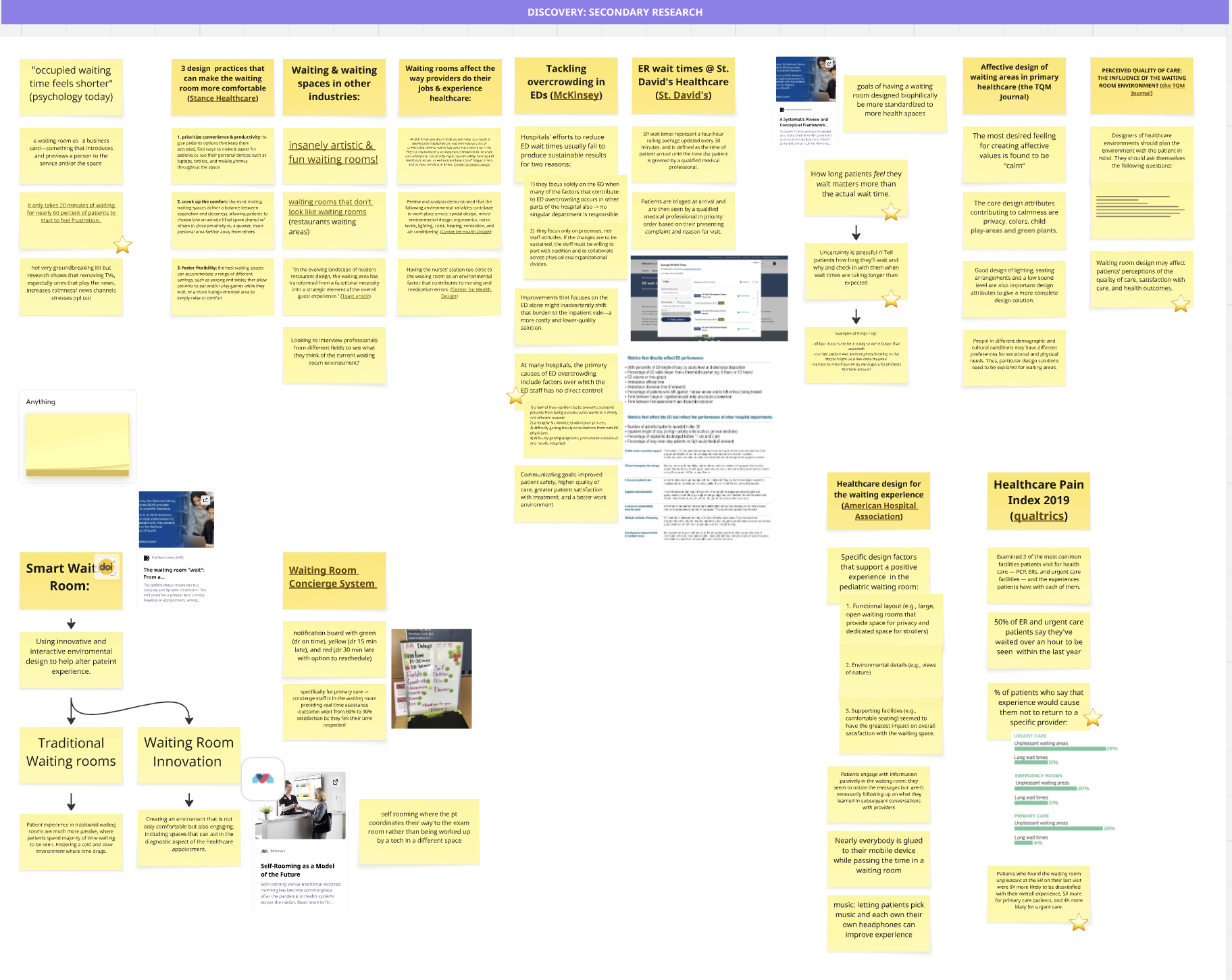
Foundational Research
To understand the waiting room as a system, we looked beyond the patient’s chair. We spent our limited two-week timeline conducting targeted interviews and shadowing at a local clinic, realizing that the waiting room is a shared ecosystem: any intervention for the patient would directly impact the receptionist’s workflow.
Receptionist Workflow: Through interviews, we learned that unknown waits lead to constant interruptions at the front desk, as anxious patients repeatedly ask for updates, pulling staff away from critical administrative tasks.
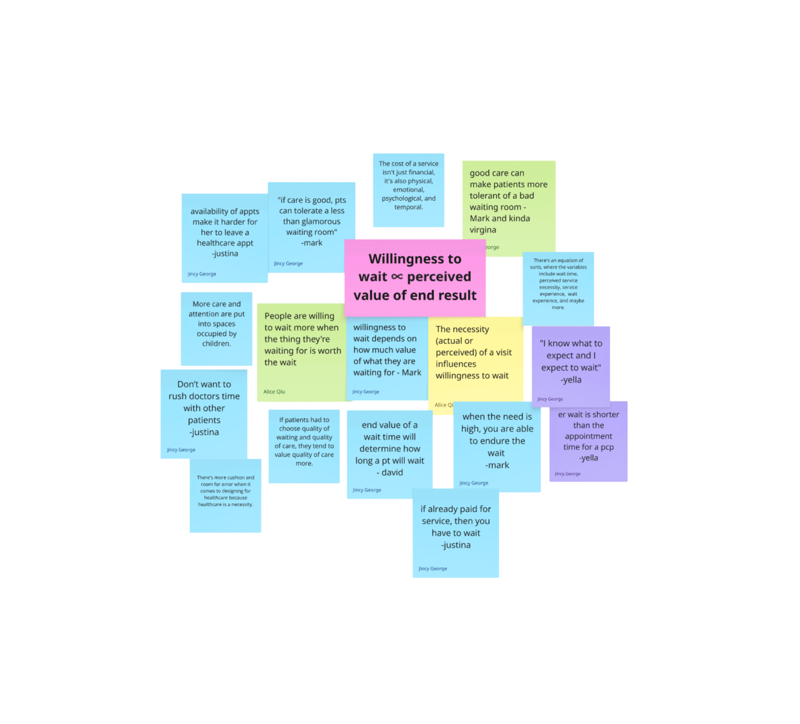
Because of our tight timeframe, we leaned heavily into secondary research and studies to understand the psychology of waiting. We found that even in the most comfortable environments, there is a 20-minute threshold, a point where patient frustration spikes regardless of physical amenities. This confirmed that the stress wasn't about the room's comfort, but about the perceived loss of time.
Insight Framework
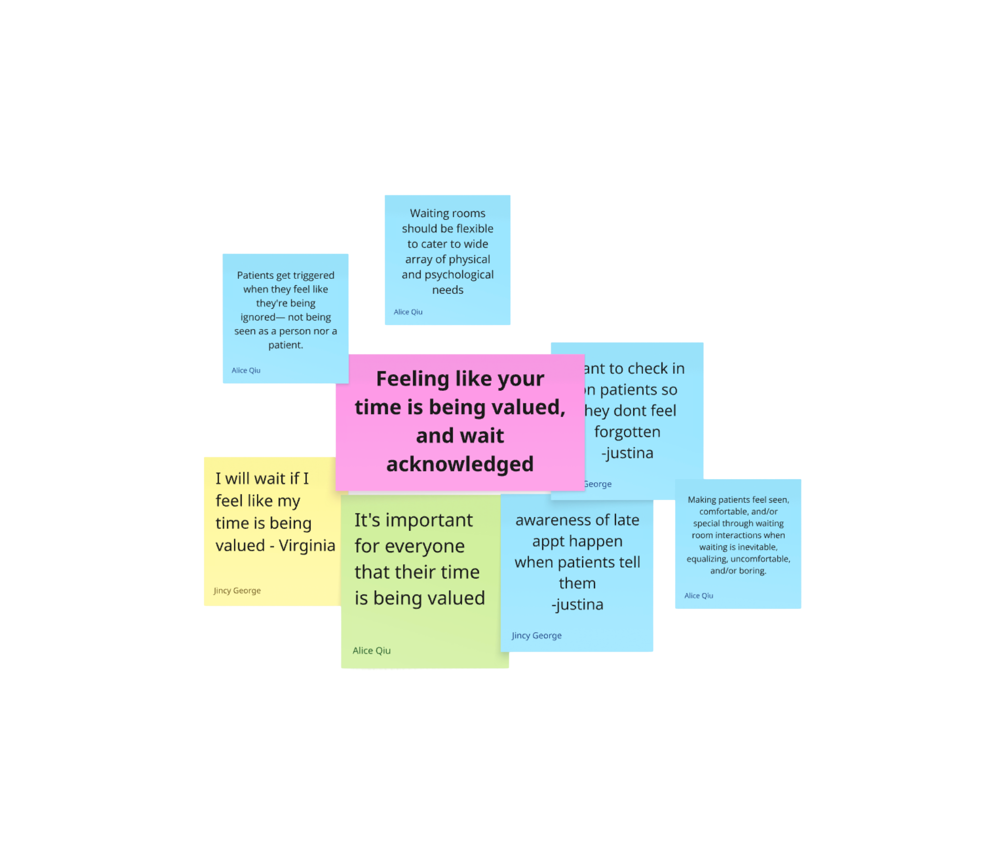
Synthesizing our research was the turning point of the project. By clustering our fieldwork notes and patient interviews, we moved past the surface-level request for comfort and uncovered the psychological mechanics of the waiting room. We realized that for patients, waiting is not a passive act, it is an evaluation of respect. Our synthesis revealed three core pillars that redefined our strategy. As one patient told us: "I know they have a system and I’ll get seen, but it’s less friendly... there’s just more ambiguity." This confirmed that our solution needed to be an expectation-management tool, not just a digital sign. We identified that the waiting room is a high-stakes touchpoint where the patient's trust in the provider is either built or eroded. By solving for transparency, we weren't just fixing a space, we were protecting the doctor-patient relationship before it even began
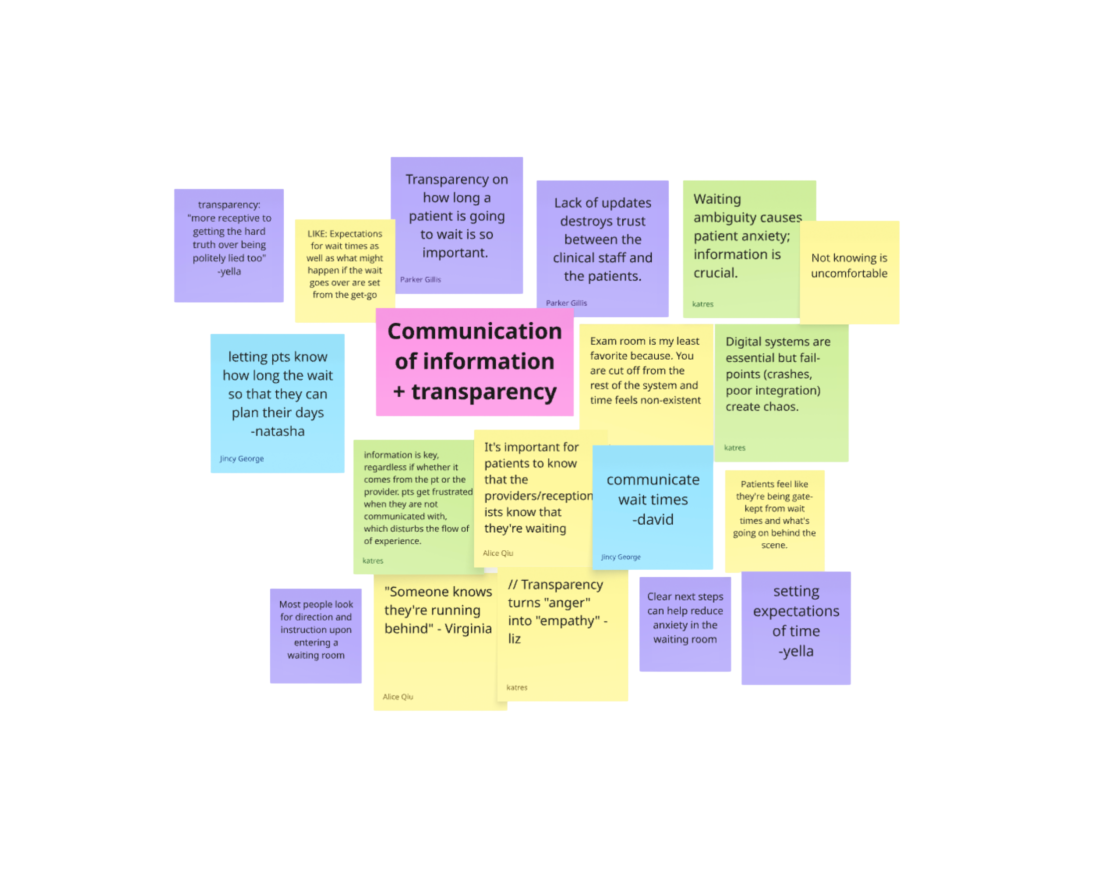
"Regardless of how long you tell me it’s going to be, I’m stuck with this (health) service no matter what. I prefer to know how quickly to be in and out, but with the visual system so you can mange your time better”. -31 year old female patient
Ideation & Prototyping
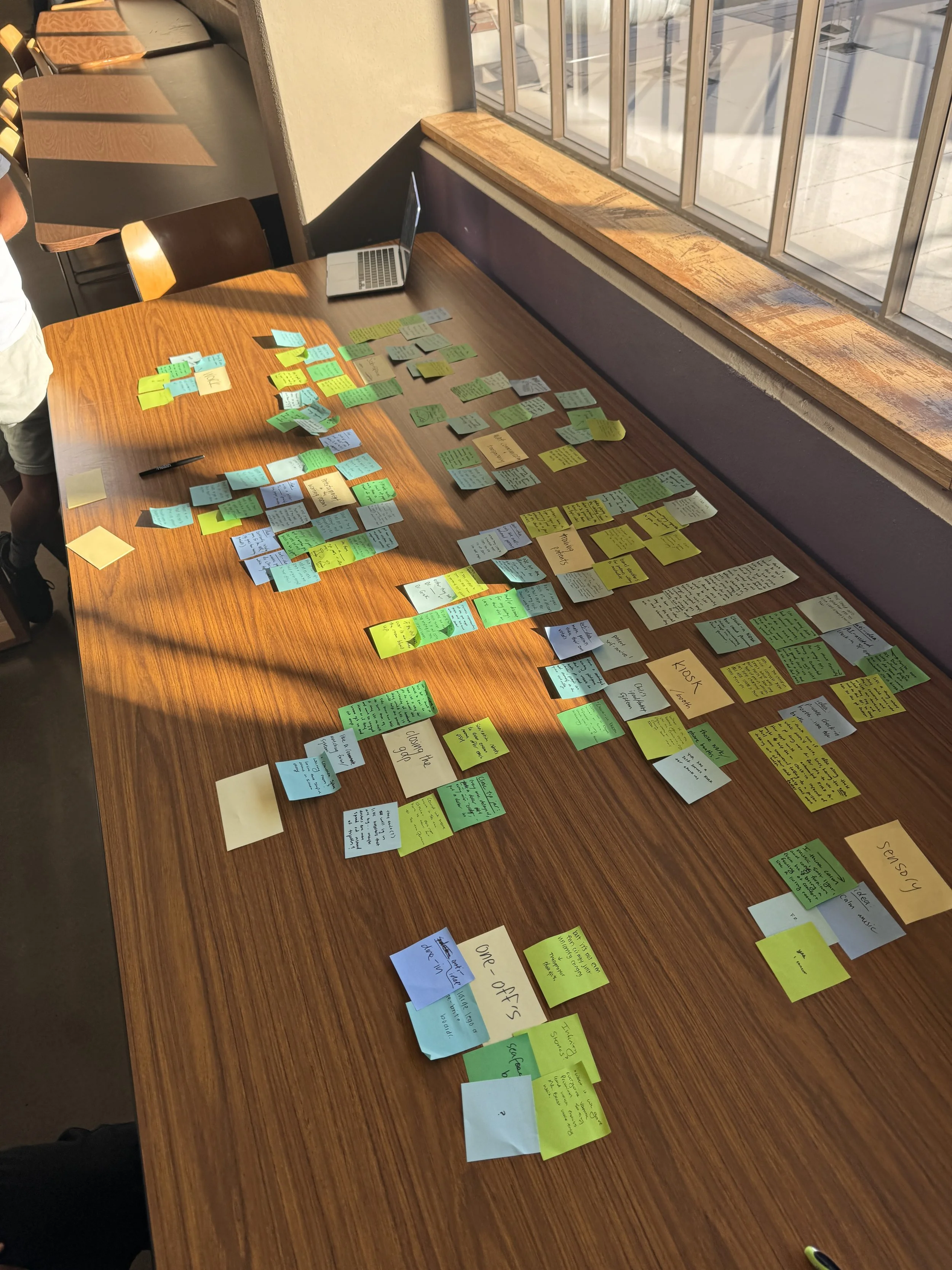
Our brainstorm surfaced 50+ ideas across three directions: environmental improvements to the physical space, digital distraction tools to occupy wait time, and transparency-based solutions that addressed the information gap directly. Early user feedback quickly eliminated the first two. Patients didn't want entertainment, they wanted acknowledgment. From there I led the team in building a decision framework grounded in our research insights and a clear set of design guardrails, which allowed us to objectively cut popular ideas like tablet consoles that felt intuitive but didn't serve our core goal. We moved into low-fidelity sketching and wireframing, testing queue visualization concepts with users before committing to the dual-touchpoint model of wall display and mobile interface.
Design Guardrails:
Core Requirements: The solution had to provide real-time updates, be accessible across different device types (TV vs. Phone), be HIPAA-compliant, and integrate into the existing staff workflow without adding burden.
Strategic Exclusions: We explicitly avoided features that felt like distractions (games, heavy marketing, or patient education), and precise wait times. Our research showed these inadvertently signaled a long wait and increased frustration rather than reducing it.
Final Outcome
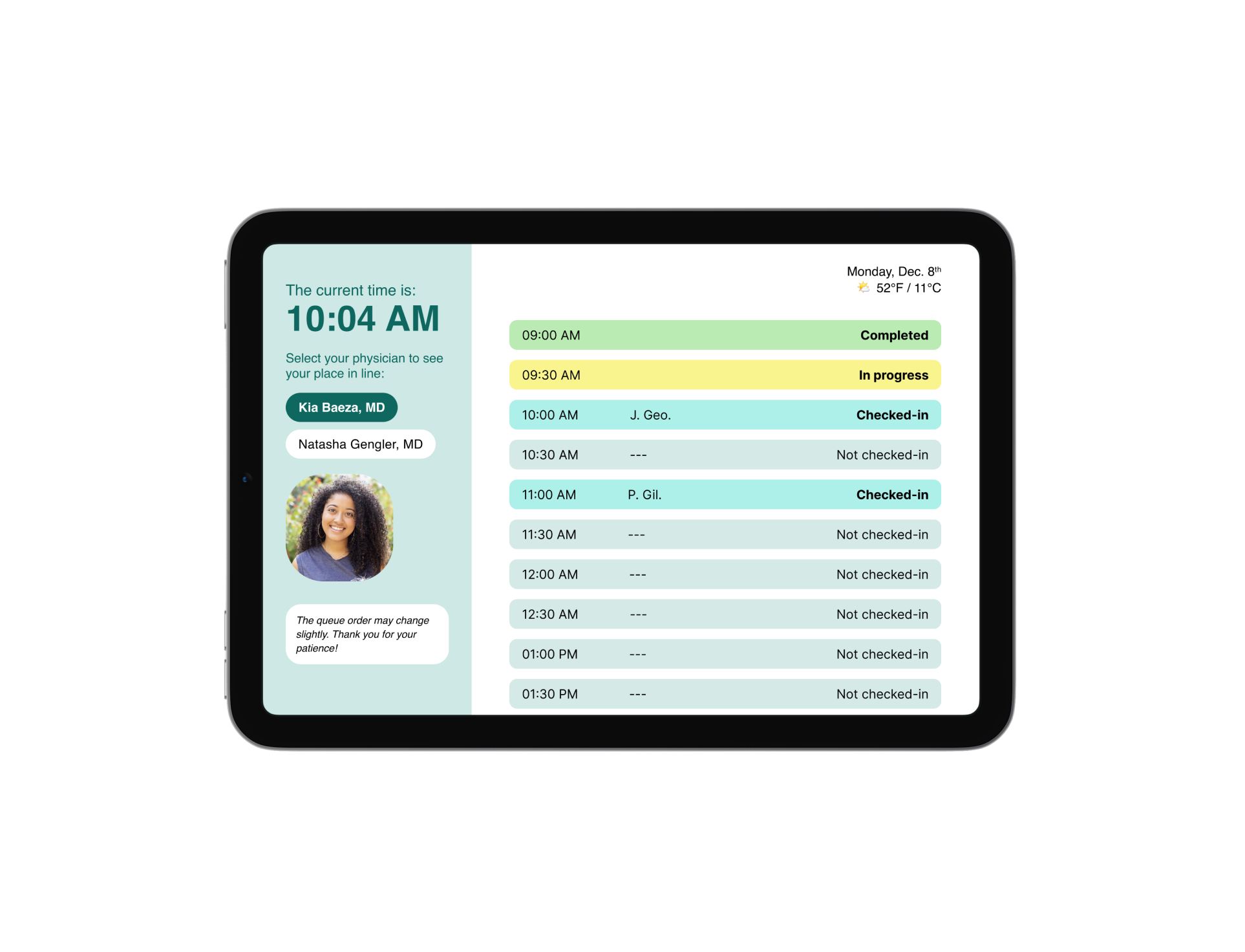
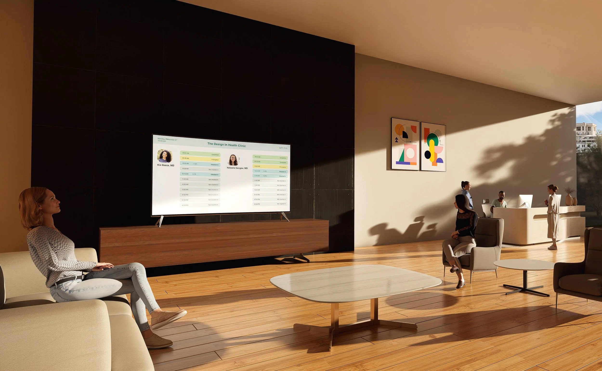
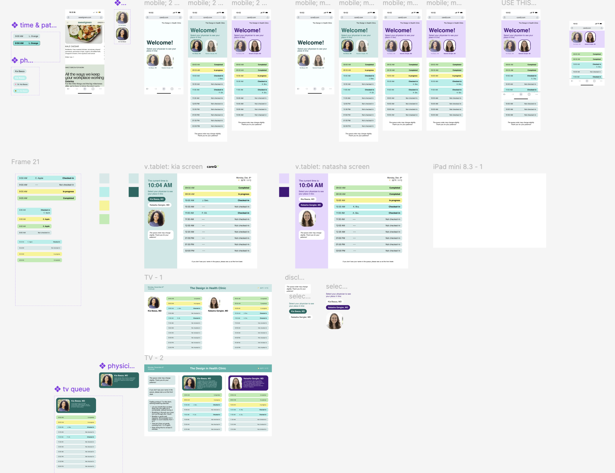
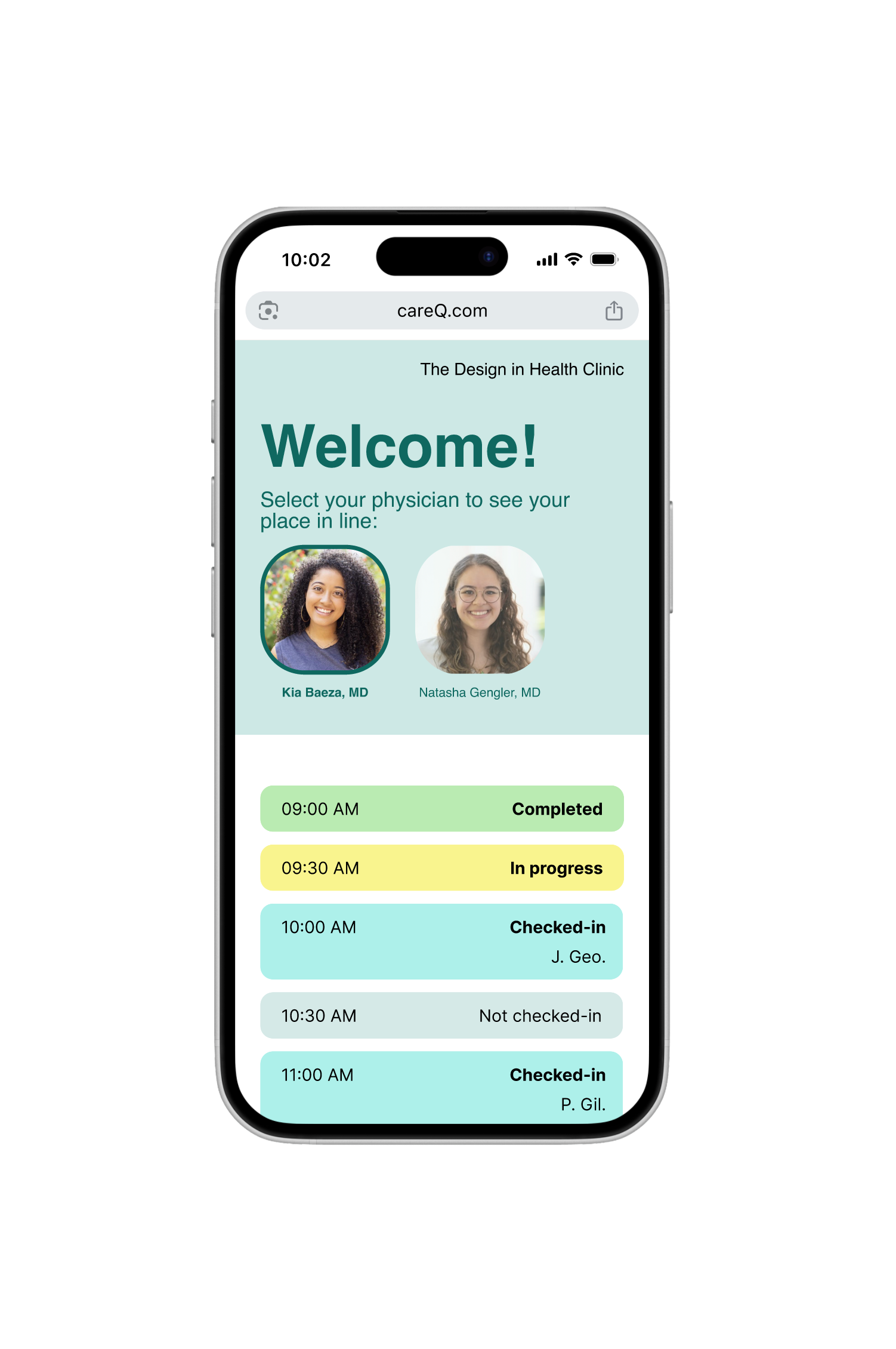
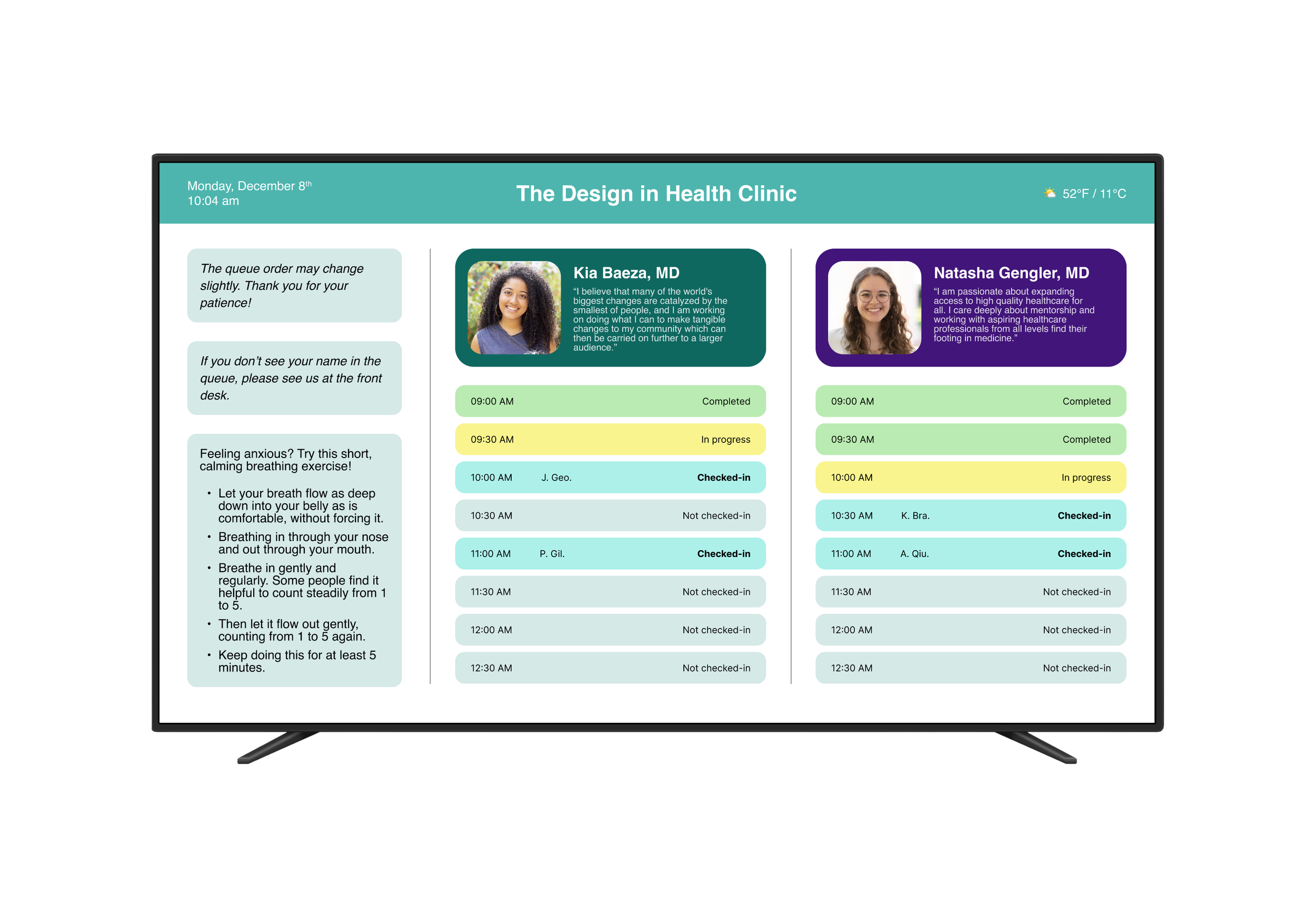
The result was careQ: a dual-touchpoint service that replaces the uncertainty in the waiting room with real-time transparency. By visualizing the queue, we gave patients back their sense of agency, allowing them to manage their own time while they wait for care.
The Patient Experience: Upon check-in, patients can see their HIPAA-compliant name listed on the queue. They can monitor their progress via a wall-mounted display in the lobby or a mobile web interface on their own device, seeing exactly how many people are ahead of them and their estimated time to care.
Implementation & Feasibility: Beyond the UI, we delivered a multi-phase implementation plan. This included a 30-day pilot program and an instructional walkthrough for clinic staff, ensuring that the transition to transparency was supported by internal IT and front-desk workflows.
The Impact: We moved from a goal of decorating a room to redesigning a relationship. The concept was presented as a fully developed service proposal and received positive feedback from instructors and peers, validating that the transparency-first approach addressed a real and recognizable problem. Rather than a screen redesign, we delivered something ready for real-world consideration with a phased implementation plan, staff workflow integration, and a dual-touchpoint service that a clinic could realistically pilot.
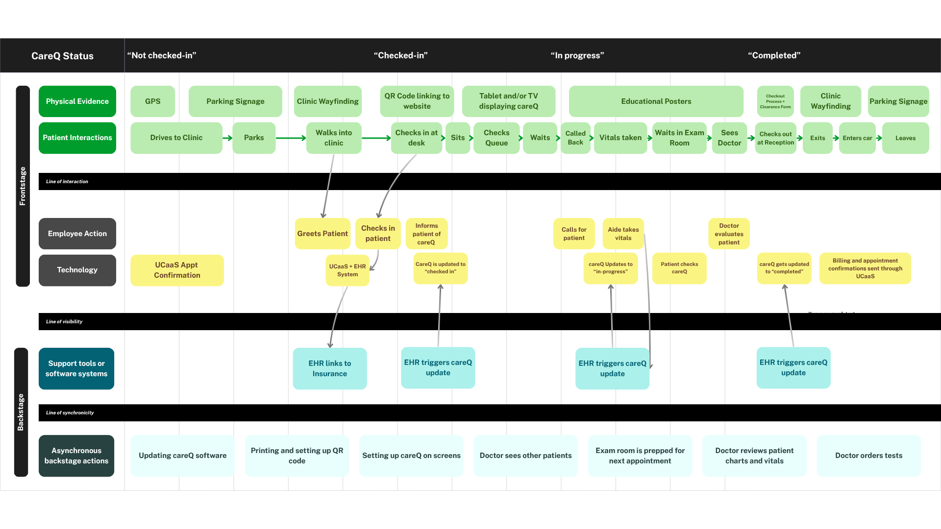
The Backbone of the Service: The Blueprint While the UI focused on transparency, the Service Blueprint was where we solved for feasibility. I led the development of the blueprint to map the "Line of Visibility" from my emergency room experience—ensuring that the real-time updates seen by the patient were triggered by simple, low-friction actions from the clinic staff.
Front Stage: We mapped the patient’s journey from check-in to exam room, identifying exactly where patients will be introduced to careQ so they can see the real-time queue.
Back Stage: I identified a critical need for the system to integrate with existing Electronic Health Records (EHR) so that a receptionist simply changing a status to "Arrived" would automatically update the CareQ queue.
Support Processes: We accounted for IT integration and staff training, acknowledging that the service’s success depended on the clinic’s internal buy-in.
Retrospective
Reflection: Solving the Right Problem Our most significant breakthrough was recognizing that the "waiting room problem" wasn't about physical comfort—it was about a lack of agency. By shifting our focus from spatial design to wait-time transparency, we addressed the root cause of patient anxiety. careQ transforms a liminal, frustrating "black box" into a manageable experience, allowing a parent to know if they have time for a work call or a school pickup.
Learning: The Blueprint as a Diagnostic Tool If I were to approach this project again, I would lead with a service blueprint immediately following our initial research. While we used the blueprint late in the process to map out implementation, using it earlier as a diagnostic tool would have surfaced systemic friction points—like the "Acknowledgment Gap"—before we even began ideating. This would have streamlined our path to the final solution even further.
Team & Role
careQ was a collaborative effort with Alice, Katres, and Parker as part of a service design course. As a UX and strategy contributor, I worked across research, wireframing, and prototyping, co-developed the design guardrails that kept the team aligned when 50+ ideas were on the table, and led the development of the service blueprint — translating our insights into a feasible back-stage system that made the front-stage experience possible. I also kept our team process intentional, facilitating weekly retrospectives and making space for every voice in the room, particularly during brainstorming where quieter perspectives often surfaced the most useful ideas.
The project pushed me to be courageous about holding the line on decisions that served the user over what felt popular, and to stay growth minded when the research led us somewhere we didn't expect.
Takeaways: Failing Fast & Design Guardrails The tight six-week timeframe forced us to be disciplined. When our initial concepts for kiosks and tablets failed to resonate with users, we didn't double down; we pivoted. This is where our Design Guardrails became essential. By stripping away "distractions" and focusing on functional transparency, we proved that in healthcare, 'less is more.' We protected the primary goal: building trust through predictable, transparent communication.