The real barrier to eating well isn't finding recipes. It's coordinating the people who need to make them happen. prepped is an end-to-end meal planning app designed to turn the chaos of household cooking into a shared, manageable rhythm.
Overview
Meal planning fails not because people lack recipes or motivation but because the coordination between people breaks down. Research revealed that the real friction wasn't finding what to cook, it was the uneven distribution of mental load, the mid-week momentum loss, and the small inventory gaps that caused entire meal plans to collapse. The problem wasn't a recipe app problem. It was a collaboration and systems problem.
Project Reframe
Duration: 12 weeks
Role: UX Design, UI Design, UX Research,
Tools: Figma, FigJam, Google Drive, Usability study platforms
Foundational Research
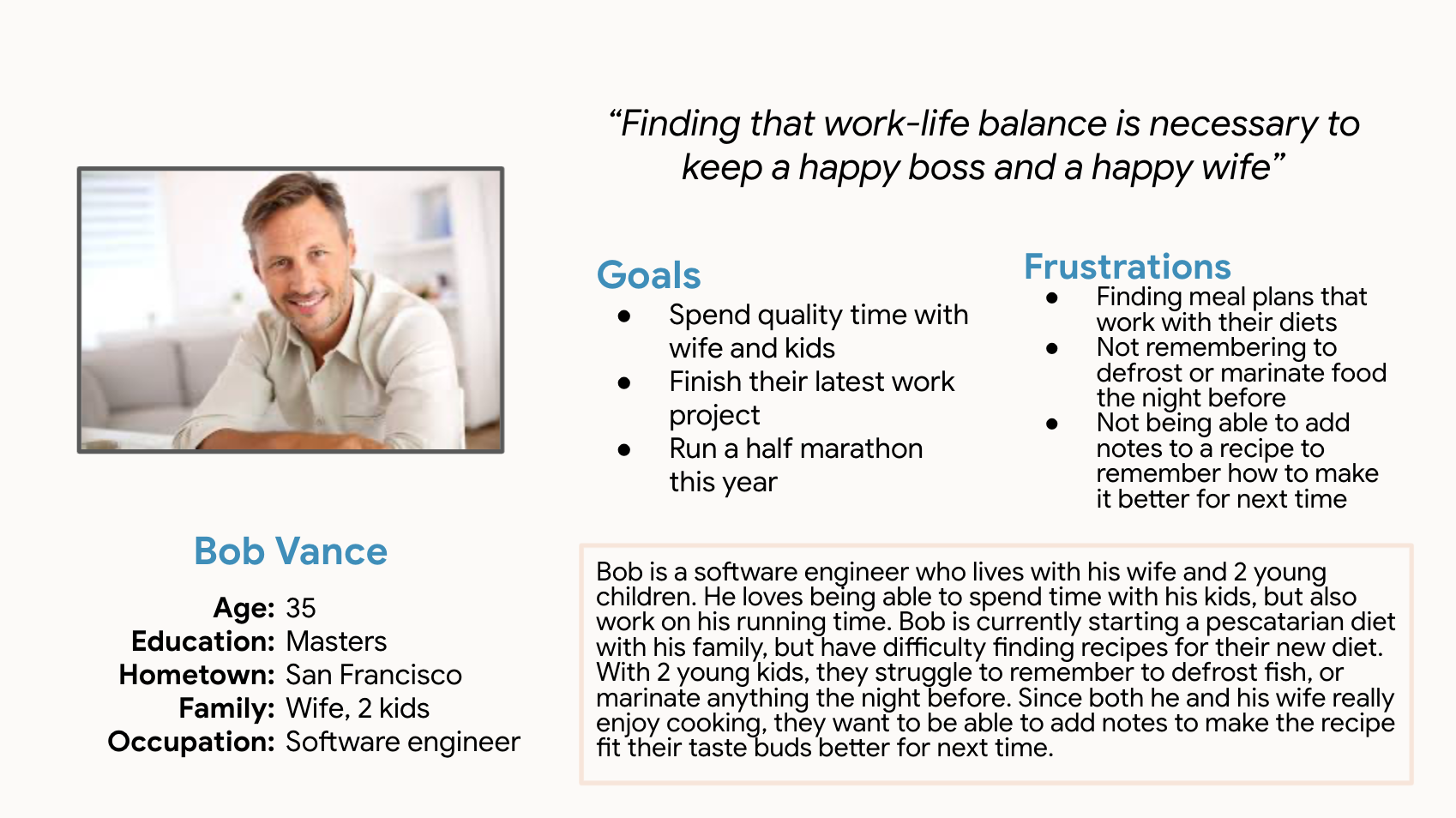
Through targeted user interviews I identified two primary user groups: busy students managing shared households on limited time and budgets, and professional parents balancing weekday efficiency with their family's diverse tastes. Both groups described the same pattern that planning started strong and collapsed by mid-week, not from lack of effort but from lack of structure and shared ownership.

Insight Framework
Four patterns emerged across interviews: responsibility defaulted to one person, generic platforms ignored cultural and personal habits, planning only covered the first two days, and a single missing ingredient was enough to abandon the entire plan. Meal planning wasn't failing at the recipe level. It was failing at the coordination layer.
01/ The Imbalance of Responsibility
Collaboration often collapsed into solo effort. Users felt the 'mental load' of managing everything themselves, and without clear roles, the friction of coordinating led straight to decision fatigue and takeout.
02/ The Personalization Gap
Generic recipe databases failed to meet diverse and cultural needs. Users felt restricted by rigid platforms that didn't allow for adjustments or accommodate their unique, long-term eating habits.
03/ The Mid-week Momentum Slump
Planning typically focused on only the first 48 hours. By mid-week, the lack of a sustainable system caused users to lose focus, leading to a cycle of fast food when exhaustion outweighed their initial intentions.
04/ The Inventory Friction
Small omissions led to large-scale waste. Forgetting a single ingredient often acted as a barrier to follow-through, causing users to abandon their meal plans and leave fresh groceries to go to waste
Ideation & Prototyping
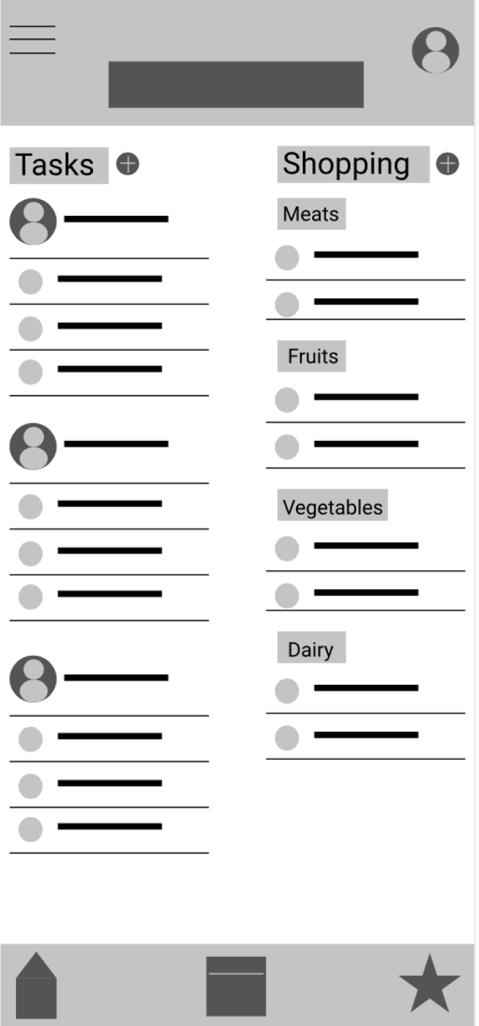
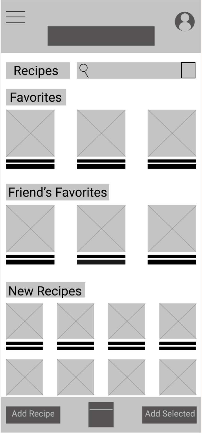
People don't fail at meal planning because they don't care. They fail because the system asks one person to hold everything in their head. The design direction focused on distributing that cognitive load by giving households shared visibility, shared ownership, and shared decision making. When everyone has a voice in what gets cooked, everyone feels more accountable for making it happen. From there I moved into low-fidelity wireframes to test whether the core flows actually reduced friction before committing to visual design.
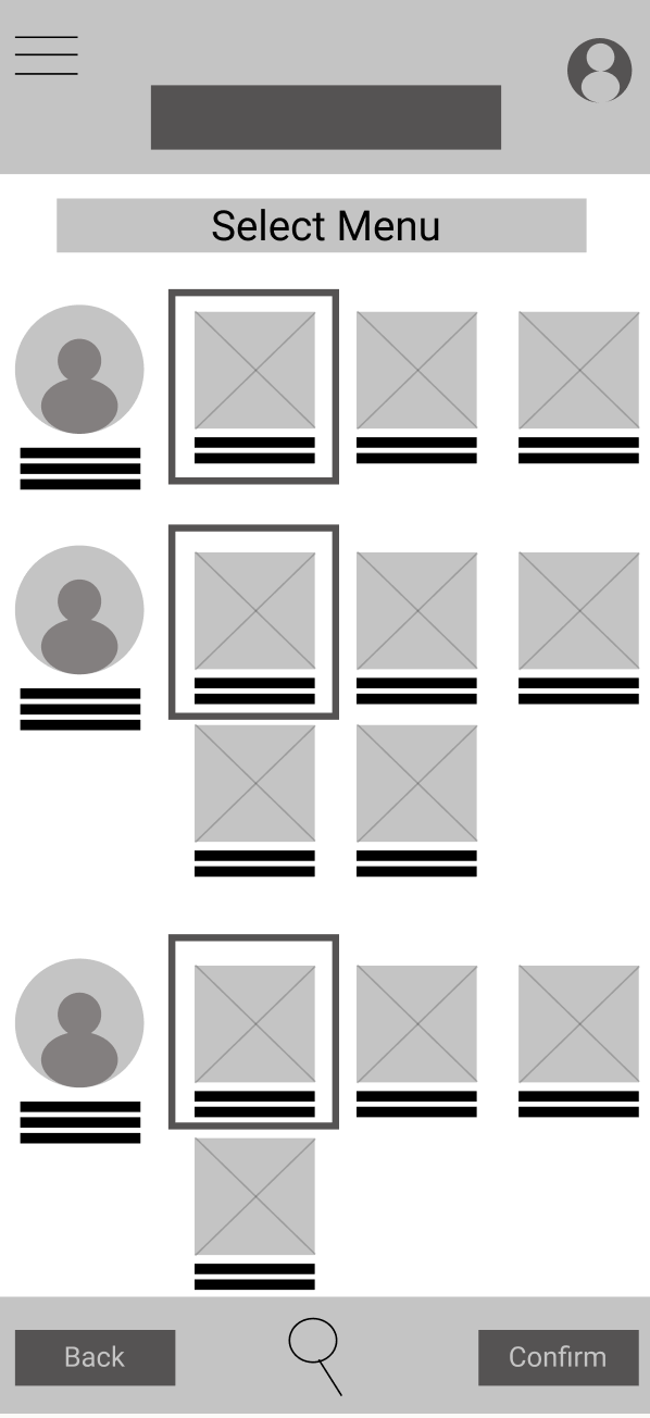
Low Fidelity Prototype & Usability Study
Access to lo-fi prototype on figma here.
Unmoderated remote usability studies were conducted with 5 people between the age of 21-65. Users generally understood the core flow but three friction points surfaced consistently
01/ Button Accessibility
Users found it difficult to click on the buttons or confused on where to click. The buttons were either too small to be able to click, or navigation buttons were not clear enough to know how to continue.
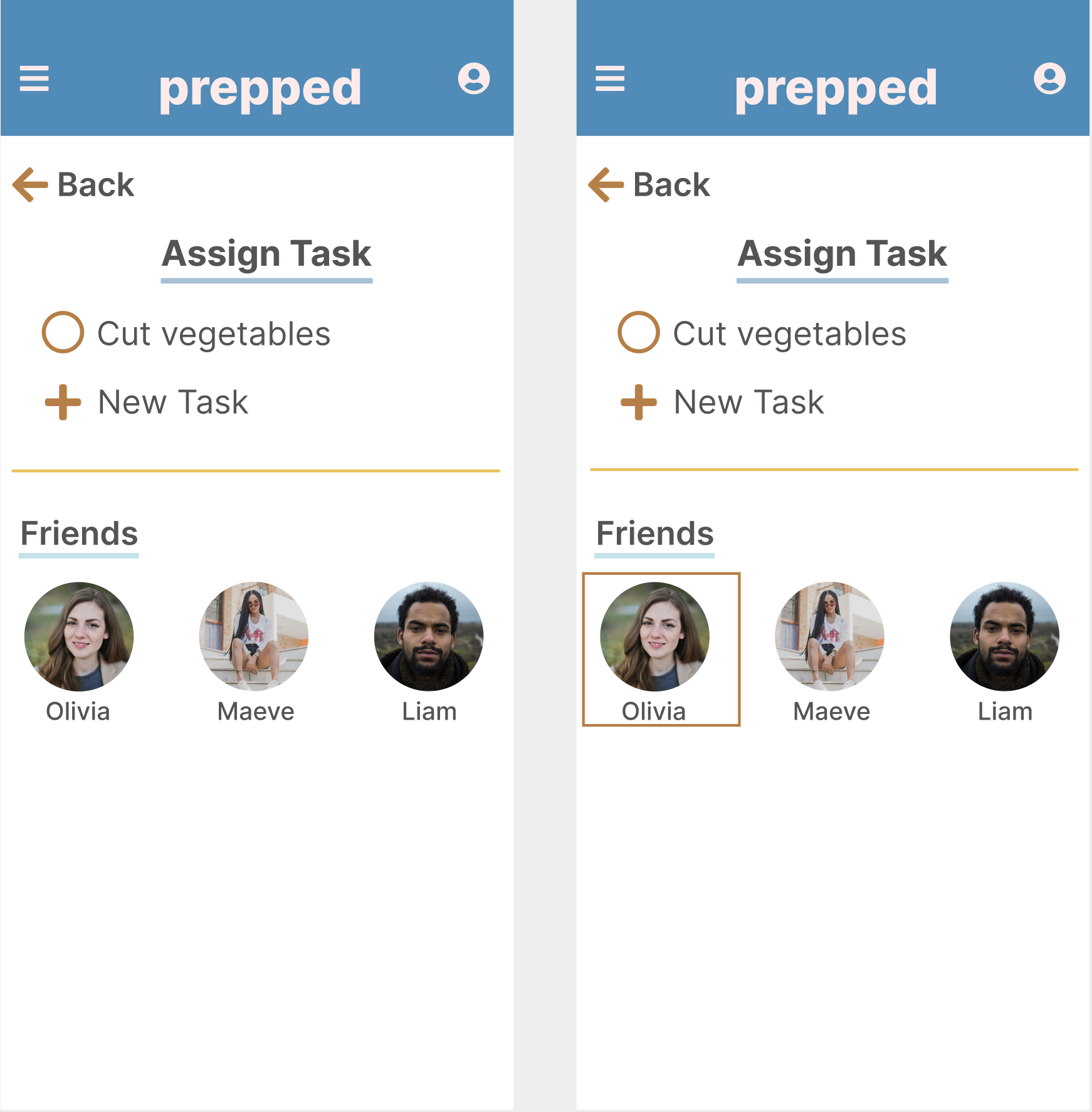
02/ Assigning Tasks
All users found assigning tasks to be difficult since it was not clear from the end of the user flow on how to access tasks.
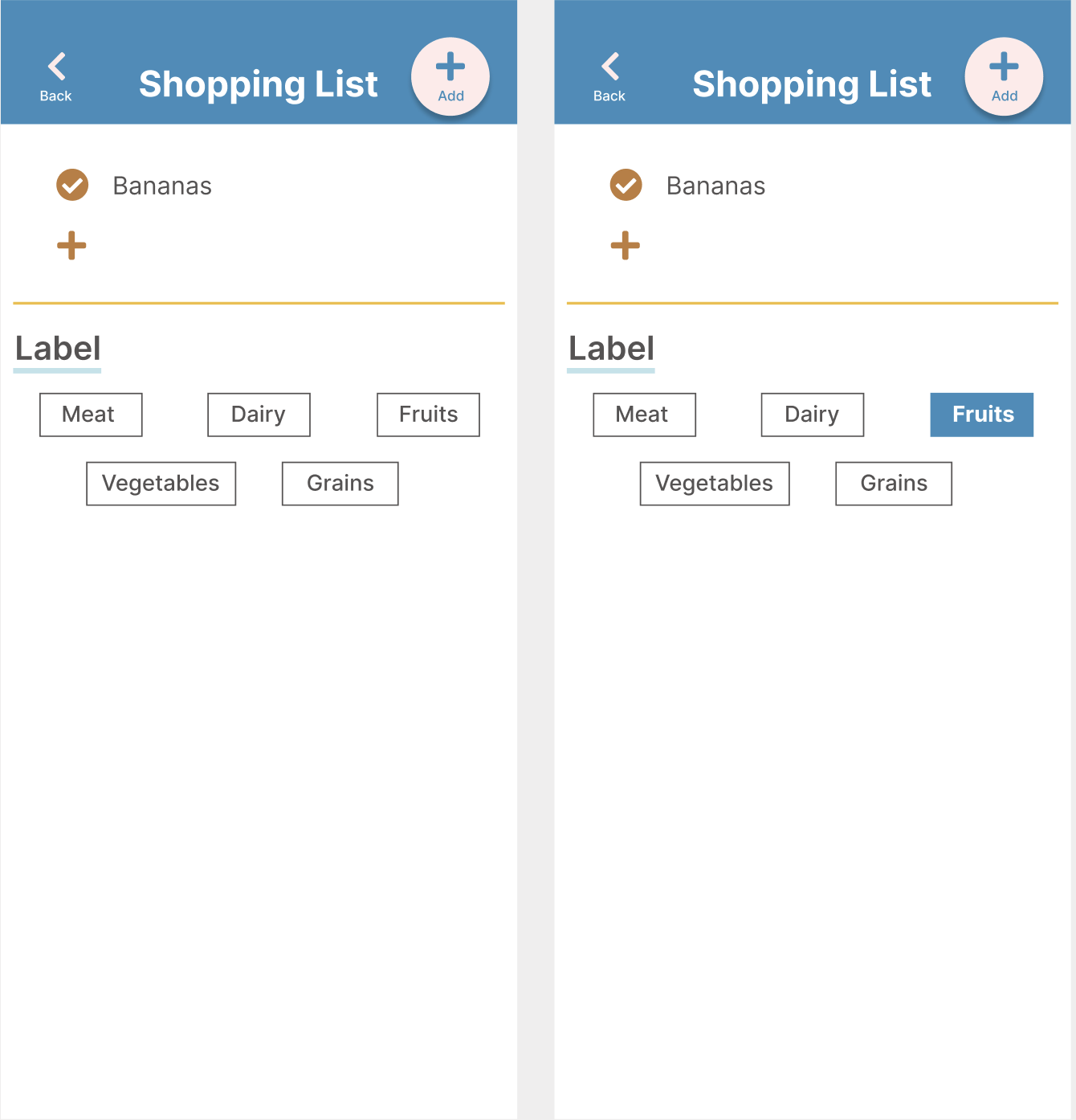
03/ Shopping List
Some users preferred to add directly to the pre-made labels instead of clicking the add button and having to click another label.
Mockups
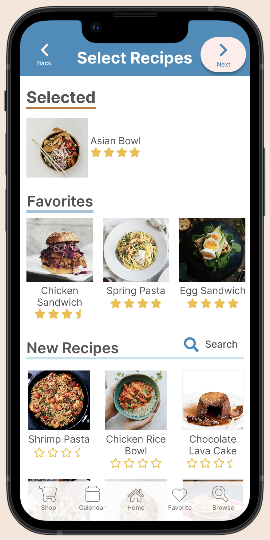
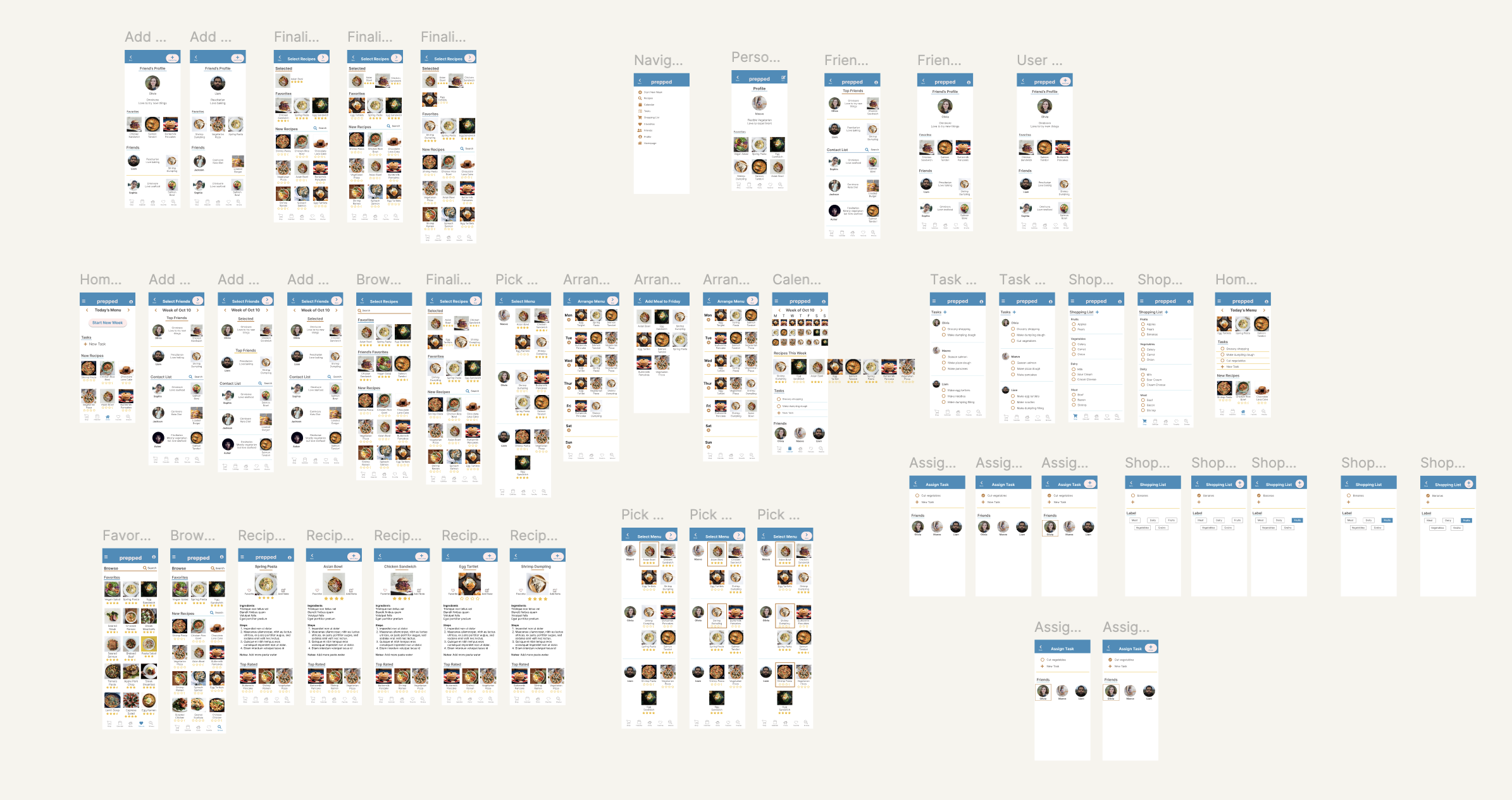
Mockups of all screens
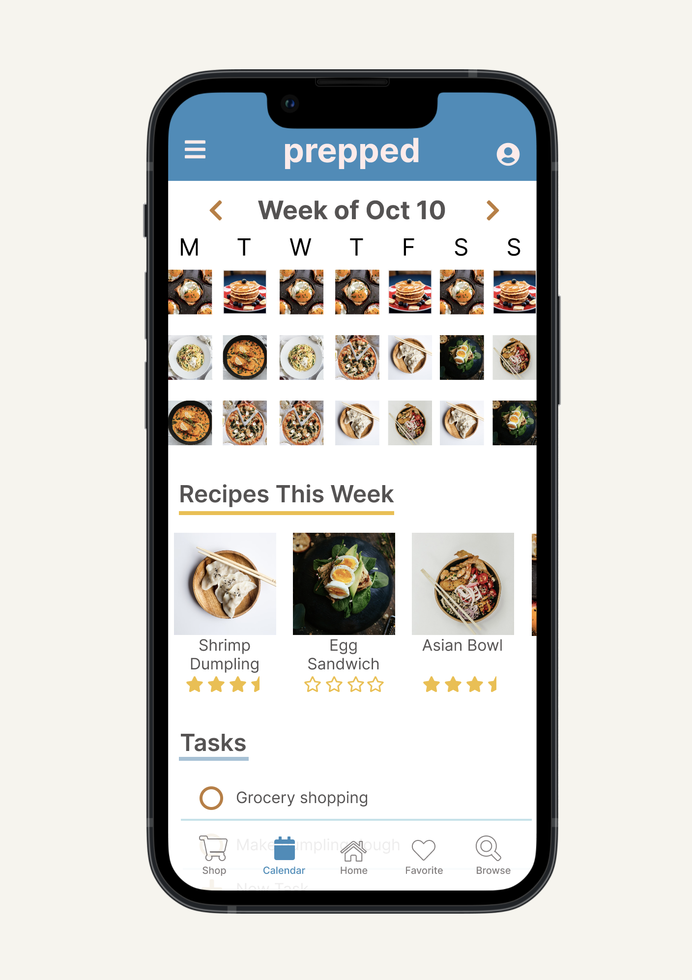
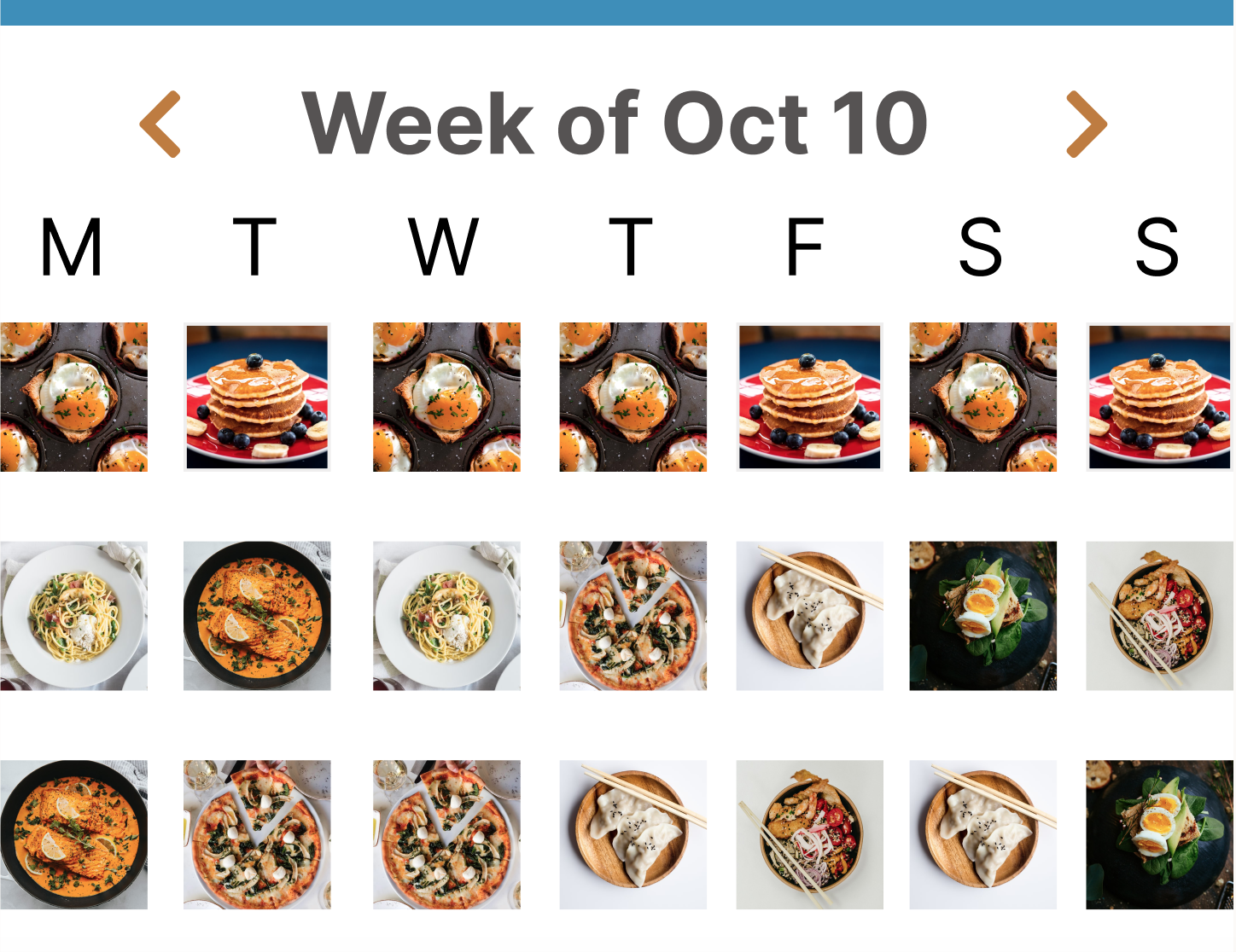
Calendar Page of prepped
Final Outcome
Healthy eating at home rarely fails because of willpower. It fails because the system asks too much of one person. prepped was built on the belief that when households share the decision making, the prep work, and the grocery runs, healthy eating stops being one person's burden and starts being everyone's habit. The hi-fi prototype was validated through usability testing and iterated based on real user feedback.
Access hi-fi prototype on Figma here
It has the ability to combine uses of multiple apps into one which streamlines my work. Also, I like the ability to delegate work and see meal plan at a weekly glance."
-32 year old male with roommates during usability study
Retrospective
When the system works, the behavior follows
prepped reinforced a core design belief: behavior change doesn't start with motivation, it starts with structure. When the system makes it easy to share responsibility, people show up differently. That insight has shaped how I think about every design problem since.
Figuring it out was part of the job
This was my first end-to-end design project and I learned by doing. From mastering Figma's auto-layout through YouTube sessions to getting roasted on Reddit for early concepts, every piece of feedback sharpened my ability to filter noise, stay objective, and iterate toward something better. This project proved that I don't need a roadmap to find the right solution. I just need the curiosity to start and the resilience to iterate.
Where medicine meets design
This project was my first step across the bridge from clinical thinking to design thinking. In medicine, uncertainty feels dangerous. In design, I discovered that uncertainty is the starting point. The same instinct that made me a careful observer in the ER, watching, listening, looking for patterns, turned out to be exactly what good research requires. My greatest skill isn't having the answers. It's having the humility to listen for them.
What comes next
If I continued developing prepped, the natural next layer would be recipe imports from personal collections and the web, task reminders for time-sensitive prep like defrosting or overnight seasoning, and nutritional tracking integrated directly into ingredients. The foundation is there. The next version would make healthy eating feel less like a project and more like a natural part of how a household runs.